Choozle Design Resources

Color Usage

Color is one of the most recognizable elements of the Choozle brand. Consistent application of our color palette strengthens brand recognition and creates a cohesive experience across every touchpoint, from digital products and websites to presentations, marketing materials, and print collateral. Thoughtful, consistent use of color also improves usability, reinforces hierarchy, and helps users navigate content more effectively.

Primary Colors

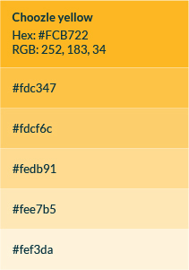
Choozle Dark Blue and Choozle Yellow are the foundation of our visual identity. These colors should be used together whenever possible, with Dark Blue serving as the primary brand color and Yellow providing contrast, emphasis, and energy.

Yellow should appear as an accent in every branded composition to reinforce a consistent and recognizable visual identity.

Secondary Colors

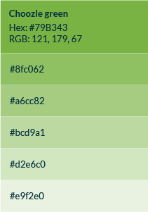
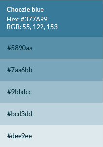
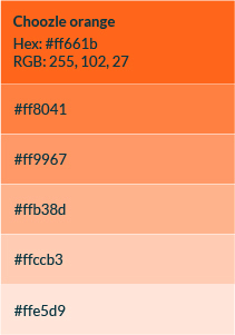
Our secondary palette provides additional flexibility while supporting the primary brand colors. These colors should be used to create visual interest, categorize information, or differentiate content, but they should never replace the primary palette as the dominant brand expression.
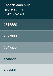
Primary Colors

Secondary Colors

Gray Color Usage

Website background color is #FFFFFF. Footer background color is #33333A. Footer text is #FFFFFF and #DFDFE5.
All website copy is #616165 unless specific headers have a hue already associated with them (the green headers will stay green, etc.)


#f7f7fa

#dfdfe5

#99999d

#616165

#33333a

Color Hierarchy

A clear color hierarchy creates consistency, establishes visual priority, and reinforces the Choozle brand across every touchpoint. Use color intentionally to guide attention, emphasize key information, and create a clean, cohesive visual experience.

Base Colors

Choozle Dark Blue should serve as the primary visual foundation for branded materials. It should be the dominant color used for headlines, primary graphics, key design elements, and other foundational components.

Accent Color

Choozle Yellow is our signature accent color. It should be used to draw attention to calls to action, key messages, icons, highlights, and other important visual elements. Yellow should appear in every branded composition whenever possible, reinforcing a consistent and recognizable Choozle identity.

Secondary Colors

Secondary colors provide flexibility while supporting the primary palette. They should be used thoughtfully to organize content, distinguish categories, or add visual interest without competing with the primary brand colors.

When using secondary colors:

  • Use one or two secondary colors within a single composition whenever possible.
  • Ensure secondary colors complement, rather than replace, Choozle Dark Blue and Choozle Yellow.
  • Maintain a balanced color palette that keeps the primary colors visually dominant.


Best Practices

  • Begin each design with Choozle Dark Blue as the primary foundation.
  • Use Choozle Yellow intentionally to create emphasis and establish visual hierarchy.
  • Introduce secondary colors only when additional differentiation or organization is needed.
  • Maintain sufficient contrast between text and backgrounds to ensure readability and accessibility.
  • Use color purposefully to support the message, not simply for decoration.

Accessibility

Color should improve communication, not replace it.

Always maintain sufficient contrast between text and background colors to maximize readability and accessibility. Never rely on color alone to communicate meaning. Pair color with icons, labels, or supporting text when appropriate.

Typography

Typography plays an important role in the Choozle brand experience. Our typography system uses Lato and Montserrat to create a clear, modern, and approachable visual identity. Together, these typefaces establish hierarchy, improve readability, and ensure consistency across every touchpoint.

Lato

Lato is Choozle’s primary brand typeface. Its clean lines and subtle rounded details balance professionalism with approachability, making it ideal for the majority of our communications.

Recommended use:

  • Body copy
  • Presentations
  • Marketing collateral
  • Website content
  • General communications

Montserrat

Montserrat is our display typeface. Its bold, geometric letterforms create strong visual impact and are best suited for moments that require emphasis or elevated branding.

Recommended use:

  • Hero headlines
  • Campaign creative
  • Landing pages
  • Advertising
  • Event and tradeshow graphics
  • Social media graphics


Use Montserrat selectively to create emphasis while maintaining a consistent visual hierarchy.

Headers

  • Weight: Use Montserrat Bold or Lato Bold, depending on the design system and application. Montserrat is recommended for marketing campaigns and high-impact creative, while Lato works well for everyday communications and long-form content.
  • Casing: Headers may be set in ALL CAPS, Title Case, or Sentence case, depending on the design and intended emphasis. Maintain consistent casing throughout each piece.

Body Copy

  • Weight: Use Lato Regular for all body copy to ensure maximum readability across print and digital applications.

  • Casing: Body copy should always be set in Sentence case. Avoid using ALL CAPS for paragraphs or extended passages of text.

Eyebrows

  • Purpose: Eyebrows introduce content by providing concise context before the primary headline.

  • Styling: Eyebrows should always appear smaller than the headline and be set in Montserrat Bold or Lato Bold, depending on the design system, to maintain a clear and consistent typographic hierarchy.

Website Sizes

HTML Tag Font Size Size in Pixels Line Height
H1 2em 32px N/A
H2-Headers 2.25em 36px N/A
H2 1.75em 28px N/A
H3 1.5em 24px N/A
H4 1.25em 20px N/A
P 1em 16px N/A
H5 1em BOLD 16px N/A
H6 .75em 12px N/A

Graphic Elements

Product screenshots should always correlate with the copy it is supporting, and whether it is feature-specific or just the platform overall.

When using mockups (screenshots within browsers,) a slightly diffused drop-shadow may be used to help elevate the graphic up from the background.

Screenshots should always be high-quality, and never blurry. When taking screenshots of the platform, keep in mind the negative space on the left and right of the white modules, and downsize your browser width to accommodate the extra negative space before taking a screenshot. A screenshot on a 1440px wide browser (15in laptop screen) or smaller is ideal.

Never include real data or information originating from clients.

Always try to use the most up-to-date screenshot of the platform.

Iconography

Vector Icons

Vector icons are used to represent broad concepts such as objects, features, adjectives, and nouns in the Choozle ecosystem. Check library of icons to see if one is created for your concept BEFORE creating a new icon. Make sure any new icons can be used universally and are scalable for usage.  Custom icons are preferred over commonly used stock icons. Icons should be in SVG or PNG format.

Checkmark icons on the website should always be Green (#78B322), unless on a specific campaign landing page.

Use of icons should be specific to the topic they are supporting, to reduce discrepancy. Specific icons are used for specific representations. If you aren’t sure if an icon exists for a specific subject, such as “education”, please ask the Marketing team.

Fill colors: Icons can be one fill color depending on the background. Icons can also have more than one color but not more than two. The acceptable color combinations are #083340 & #fdb825, #083340 & #78b332

Size: Vector icons on the website have 3 class sizes—small, medium, and large. Icons shall NOT be any smaller or larger than the designated sizes. Utilize the class names instead of using inline styles.

Class names:

line-icon–medium (height: 5.625em or roughly 90px high)

line-icon–small (height: 3.75em or roughly 60px high)

line-icon–large (height: 7.5em or roughly 120px high)

If you need a tiny icon, utilize the free icons provided with our theme (font awesome, icomoon, etc.) because those are meant for smaller sizes.

*Any vector icons for special documents that have their own brand styles can be a bit more flexible with colors, sizes, and combinations but should still feel like an extension of Choozle’s branding.

Client and Partner Logos
Client Logos Partner Logos

Photography

Photography plays an important role in expressing the Choozle brand. Strong imagery builds trust, reinforces our brand story, and creates engaging, authentic experiences across every touchpoint. Select photography that aligns with Choozle’s modern, approachable, and technology-driven identity.

  • Prioritize authentic, candid photography that captures natural expressions and genuine moments.
  • Feature people, technology, or a combination of both when showcasing Choozle or our products.
  • Use close-up imagery of computers, devices, keyboards, hands, and digital interactions to reinforce our connection to technology.
  • When computer screens are visible, display relevant Choozle content whenever possible, such as the Choozle platform, dashboards, or other branded experiences.
  • Choose imagery that feels clean, contemporary, and professional while maintaining a natural, approachable aesthetic.
graphic design guidelines

Buttons & Calls to Action

Call to action buttons and links can serve a variety of functions. After all, “call to action” is really a bit vague. All it means is that its main purpose is to get a visitor to your site to do something.

Buttons

Primary and secondary colors will be used for all buttons and links on the main website. The blog follows the same structure but individual blog posts are more flexible and may utilize any color, depending on use.

Because of the reduction in button colors, ghost buttons are highly encouraged when two buttons are used next to each other, or when a button is needed more than a link, but isn’t considered a highly important CTA (such as a secondary link). Use ghost buttons only when button is visible from background.

Links

Links should follow standard web conventions to create a familiar and accessible user experience. Use the standard web link color (#0000EE) unless a specific design system or component requires otherwise.

Links should:

  • Be descriptive and clearly communicate where they lead.
  • Use Lato Regular and follow the surrounding text styling.
  • Be visually distinct from body copy through color and, when appropriate, an underline.
  • Avoid generic calls to action such as “Click here.”


Preferred Examples

✓ Learn more about Amazon DSP

✓ Download the Prime Video Advertising Guide

✓ View the Choozle Brand Guidelines


Avoid

✗ Click here

✗ Learn more

✗ Read more

Decorative Elements

Favicon

Our favicon IS NOT our logo. Our favicon exists specifically for use as the favorite icon that shows up before the url or inside of a tab in your browser.

Do not attempt to use the favicon as a Choozle logo. Do not use the favicon as a supporting asset in any creative, document, file, or presentation. Do not attempt to resize the favicon. Do not distort, add effects, alter colors, or rotate.

The only exception to the above guidelines is if a logo graphic under 50x50px is required, where the Choozle wordmark would be considered illegible. In such special circumstances, please get permission from Choozle’s Design team and they will provide the proper files.

Green Choozle site icon

Divider Lines

Divider lines on the website will utilize the “new divider” widget, or hard coded. All divider lines on website will be 1px solid #DFDFE5. White dividers may be used in special cases (such as on dark backgrounds to support white copy). All divider lines will have 60px top and bottom margins.

Example:

Drop Shadows

Do not use drop shadows on our icons. If the icons do not stand out from the background, they are being used incorrectly and the style of the icon—along with fills and strokes—should be reconsidered.

Do not use drop shadows on any text. If text is not visible against a background, the background should be altered.

Very subtle and diffused drop shadows may be used on graphics to help separate them from their backgrounds. Please see our CSS box-shadow below that may be added to elements on our website.

Bordered Content Divs/boxes with borders will have a 1px solid #DFDFE5 border. To make borders pop against white background, a subtle box shadow "box-shadow: 0 1px 4px rgba(223,223,229,.6)" can be added. Examples of this can be found on the webinars page, and the blog.

Drop shadows may only be dramatized on infographics and social graphics. You can see examples of various types of shadows on such creative, ranging from diffused to hard shadows depending on the overall style of the graphic.

Our team of digital media experts are here to meet you where you are on your digital journey. Whether you’re looking to leverage our self-service platform or managed services, we’re ready to chat about your Display, CTV, Native, Audio, Video, DOOH, Search or Social advertising needs.