
Back in 2018, I was lucky enough to attend a workshop focused on the strategic aspects of a design system. The presenter was Nathan Curtis, founder of the design/development outfit, Eight Shapes. Curtis has worked with tons of companies, both big and small, to help clients stand up design systems. I had already been following his articles on my own. My own work is at the intersection of design and code. The child of product and engineering, I code, I illustrate, do design critiques and pull requests, mull over animation timings, fearlessly dive into the guts of svg markup, talk and type too much… that sort of thing. Naturally, this workshop was something I was incredibly excited about and I bought a ticket immediately. Thankfully too, they sold out a day or two later.
I went in hoping to get a few pointers on direction. Specifically developing a strategic direction for our in-house UI component library. We wanted to translate our library into a fully fledged design system, not just a collection of code widgets and utilities. Our initial library was born out of necessity and utility. It started as folder called oh so creatively reusable, but that quickly got out of hand. Then it became an independent repo with its own versioning. Today it is so much more than that, but I am getting ahead of myself.
Back to that summer workshop two years ago. You know, when we could all sit together in a room without fear or masks. I left with tips, strategic guidance, one or two moments of existential crisis, dashes of levity and the confidence and know-how to move ahead. Much of my work since has been based on the principles laid out in this workshop.
But what is a design system you ask? Design systems are purpose driven. The primary purpose of a design system is to allow design to scale with technology. If frontend development and UI design had a baby, it would be a design system. A lego box for building user interfaces (UIs) specific to your company’s business and user needs.
A design system is also like a coin. A valuable object with two sides, technology and design. With it you scale interfaces and bolster teams’ ability to make things quickly with cohesion and a high degree of technical and visual quality. The technology, is most often the reusable bits pieces of extensible code– the component library, sometimes referred to as widgets. The other side, the design, is the guiding visual principles, the design language that informs the structure, behavior, and aesthetic of the components.
Component Library + Design Language = Design System
Our design system baby is Willow. Just like with actual babies, it’s hard to sort useful advice from noise. Who do you listen to? Your enigmatic mother-in-law who had tons of kids or the pediatrician who has saved tons of kids? Curtis was a bit of both, he knew what he knew because he had been there.
The presentations leveraged all of Curtis’ experiences and distilled them into actionable packets. The day was broken up into four sections: planning, designing + building, documentation, and practice. Everything from who is on the team, to what type of team, to color naming conventions, and design tokens. I’ll cover these broad strokes and provide the context of our own design system journey.
Planning
Getting all parties on the same page and making people feel included was the main focus here. It takes time, but it’s important for the design system, the team, and the company as a whole. We have to ask ourselves why we are building a design system in the first place.
Remember, a design system is not just a project. It’s a living product serving an ecosystem of our client-facing products. A product for your products.
We originally started building Willow out of necessity. We could not find what we wanted and needed in other third-party component libraries. Believe me, we tried. I researched a dozen react component libraries before I made the case that we needed to build our own. It was a good place to start, but getting other on the train with you is just as important.
Support from leadership is key. My colleagues and I have that support, but it meant demonstrating why something like this was a force multiplier. I compiled a brief outline of research findings that included the pros and cons and what gaps existed. Thankfully this was well received and launched our team down this path. Next comes the logistics, who’s on the team, who rotates in or out, how do we structure this thing to make it as future proof as possible. Team composition is the most important early decision.
Team Composition

Some potential compositions, based on different organizational sizes.
Many of us on the build team wear many hats. None of us are dedicated purely to one thing. So, despite the beauty of the colorful diagram above, with multi-disciplinary titrations, our reality at Choozle is simpler. With a smaller organization, it becomes a list of names rather than a theoretical bucket of titles. Here is a breakdown of our team composition who tend to Willow.

Willows Contributors
The enterprise folks I sat with at the workshop had a completely different context and experience. They were on a design system team, focused only on that. Whereas at Choozle we are on build teams and tend to the design system. Ten thousand engineers use IBM’s Carbon design system, so understandably they have a design system team larger than our entire company. Everyone working on Willow is committed and cares about more than just getting the work done. This made all the difference in the world. It meant that despite our small stature, we are still mighty.
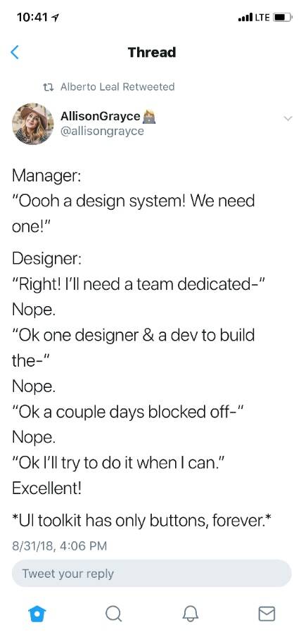
I grabbed this from a tweet awhile back, but it illustrates why many design systems never get out of the planning stages.
At Choozle, things have been different. Willow has much more than buttons. In the last two years we have been part-timing this project, we have crafted a design system with over 70 components. Each component lives under a general heading like data visualizations, composite components or utilities. It includes curated animations, formatting shortcuts and complex interlocking UI components. It now lives within the platform folder structure but has its own approach to enums, testing, components structure and is central to everything the user sees and interacts with. It is made to be easy to use by even brand new contributors, developer UX is a thing. A very important thing. Its rules and reasoning can be easily articulated and the decisions made were born out this workshop. We import what we need, when we need it. Gone are the days of complex view folders and over the top 20,000 line long stylesheets.
We’ve done a lot of great work, there is still more to be done. Thankfully Willow has been more about orienting to the pragmatic need, you set forth guard rails and over time Willow becomes more and more valuable. Our CEO, Andrew Fischer offers this principle from time to time, “Constraints are fuel.” They have fueled Willow. Direct contributors to Willow have now used this for years as well. Their ideas impact and inform it strategy. But the constraints have also helped keep it focused.
You cannot just throw in a random hex code because a mockup had a different one. There is an agreement among us that in edge cases, you don’t change Willow. You work within it to both retain the useful constraints and to broaden how things can be repurposed to maintain code and visual cohesion. I am fond of saying “It takes a village to raise a platform.” The same applies to the design system used to build the UI of that platform. We are in this together.
Design + Building
In a perfect world, you finalize a visual language for your system before you start building out components. We did this backward. We started making fast new UI components that were made to look like they had always been there so they matched the rest of the platform. We did this out of necessity. We were in a bind with an older design language and the need to leverage new technology. That is ok, everyone’s context is different.
The principles behind a design system are meant to take that into account. Throughout the workshop, Curtis outlined how to iterate on the process and make sure that you think both short and long-term. It was clear there is a strategy of roving focus. All things need equal attention to detail but not necessarily always at the same time. There’s no universal way to make one of these things.
However, it is incredibly important to be clear on what happens when a new need arises. You cannot just throw things into it willy nilly. You have to be thoughtful. Design systems have principles, not laws. Sure you can make a new component for that story, but do you need to? Can we use what we already have in a new and novel way. Sure that spacing is off by a 2 pixels in the mock up but was that intentional? Why not look back at the spacing system Willow already offers to make sure.
We still have many logistical gaps in our processes which we’re now improving. But, the workshop offered a bounty of grounding information borne out of an expert’s experience. Over time there is less and less one-off questions, fewer edge cases. Those who use the system understand that font-size with the enum MICRO naturally works with the line height enum MICRO. Autonomy comes with understanding the principles at work in a design system’s architecture and usage.
Willow has allowed us to lay the groundwork for dramatic improvements to our core UI capabilities. We’re in the early stages of a full-scale, albeit incremental platform redesign. New things are sneaking their way in as projects allow. In time, we’ll be able to fundamentally overhaul the look and feel of the entire Choozle platform the right way. No more random class collisions, no single use style classes. No more rewriting the same hex code over and over and over. I am looking at you #7cad42. Everything builds on core spacing and color domains, a fundamental set of component categories and a thoughtful approach to new additions and usage.
With a design system, you can make a single ideal “example” UI component and then leverage it over and over and over again without additional work. You never actually “get there” with a design system. But over time, inconsistencies in code and design are ferreted out. Patterns emerge all over the place and speed and quality are natural outgrowths.
The Audit
Another important aspect when building a design system is the audit or figuring out what you already have and what you need. It’s less about draconian enforcement than it is cohesion, honest appraisal, and maturity.

A UI audit doesn’t feel good to do. It’s tedious, emphasizes inconsistencies, and explicates visual mistakes. That meant cataloging every type of button, navigation, typography, and input. It means checking all their colors, heights, widths–all implementations in all contexts.
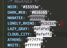
I have a buttons audit sheet that is 5000px tall. It took that much space to fit all of it in. When we started going down this road we had almost two dozen neutrals in the platform. Not just gray, but lighter light gray, darker medium light gray, another random darker medium gray that was 2/255ths different, many needlessly different grays, and so on.
Design systems streamline this and make it easy to make things cohesive and difficult to make things that are incohesive. It’s not just color either, we are talking backgrounds, text color, border color, font-size, font-family, line heights, spacing, radius, sizing, shadows, timing, breakpoints, z-indices, rems, ems, and px. It’s complexity made more complex by humans needing to revisit many of these things often. This is where the fundamentals of the design system approach are so helpful. Curtis was adamant that if you do the groundwork, you only have to handle certain things once. Sometimes that means adding things, but often it means removing them.
Sure, the human eye can see a million colors, but we don’t want a million colors in the platform. It makes things difficult to read, difficult to reproduce, conveys a spastic design sense, and an overall lack of focus. Over time, ignoring things like this adds to technical debt but also design debt, and eventually, those chickens come home to roost.
Shared Language
A design system leverages things like names to nest complexity within seeming simplicity. Those can be component naming conventions or even props that are readily discernible. Names are important for creating a shared understanding but also just for curtailing inadvertent mistakes.
Our updated neutral palette has colorful names that are easy to remember and easy to reference. It is incrementally finding its way into the platform with each cycle. Willow’s neutral colors have names like Cloud_City, Lazy_Gray, Lonely_Rhino, and Dark_Web. It keeps it simple but extensible.
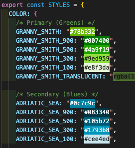
It was also suggested to make these types of names easily understood on sight. So, we may need to improve upon these names so that it’s easier to sequence them based on dark to light. In time, the entire platform will adhere to the updated color system we are leveraging in Willow. But even these names in time could be made clearer. Take for instance our later approach to saturated brand colors, they are numbered to correspond to their value from light to dark.
Our neutral enums could benefit from a similar approach, but a massive change like that means it has to come at the right time. But I think it illustrates that committing to a design system approach is not always a perfect static thing, but that is good. Over time, it evolves as well and it does so in a way that can be managed by a small team and yet benefit potentially thousands of people leveraging it.
Willow streamlines communication, eases decision making, enhances cohesion, and scales infinitely. Choozle’s original scss/compass styling implementations paired with Foundation 5’s prebuilt framework helped stand the UI up very effectively. But over time, the value of approaches like these decreases immensely. They limit your ability to adopt new designs and new technology.
Design systems make having common language paramount. It helps designers and developers and all of those in the middle to speak the same language. Good communication means that designers and developers can work closely and craft even better solutions. It is a collective agreement between design and development to use the best ideas of both worlds.
Documentation
So, you have this fancy in house system, but how does anyone know how to use it? The documentation section of the workshop was incredible but also potentially the driest aspect for the layman. Here’s an example of what an older version of our design system documentation looked. Heavy on visual examples with accompanying props tables.
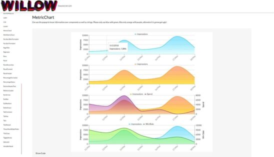
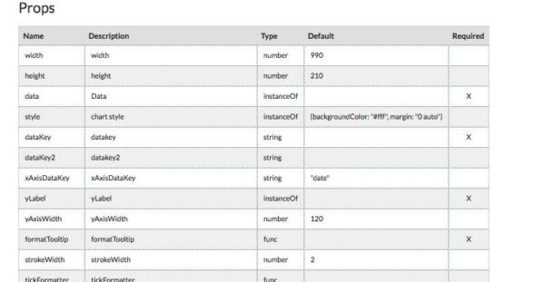
As you can see in the examples, Willow’s documentation has dynamic examples of all the components that exist within the system. Each component has its own page which provides details for developers. You can see what the exact code to implement is and our exact uses in the platform. These show all the states and variations of a given component. In time, we plan to include visual guidelines, potentially sample layouts, and exemplar mocks.
Some good suggestions from Curtis were to create code & design toggles for the pages to make the information a quick and easy reference. Also, you can craft component explorers that can dynamically change the component on-screen and hand you the small amount of code you need to implement it in the main platform. We build and use the system ourselves, so we tailor it to actual use cases and become experts in our own UI. However, that knowledge needs to be easily transferable to new employees as well. Good documentation makes this a simple process to onboard someone to use Willow.
Practice
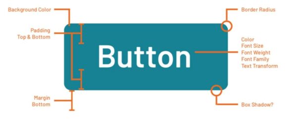
Consider for a moment the simple and often overlooked button. Think about how many individual decisions and individual lines of code had to be written to make all those different buttons happen. The button is the visual workhorse of any UI. It also has to be rewritten over and over and over. What it was and what it is now for Choozle are very different in terms of code implementation and aesthetic capability.
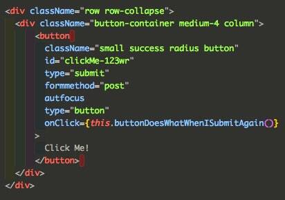
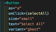
Willow allows us to shorten the implementation code for the button. Take a look below at the sample code for a submit button. It’s chock full of classes and attributes and a whole bunch of nested tags. In isolation, it is easy to make sense of, but when it gets placed inside a file that’s potentially hundreds of lines long, it can get lost.
Our Willow button component is modular, reusable, and simple to implement. It lost none of its original functionality, it actually has more dynamic functionality now but is less code to write. All that complexity is nested inside the design system itself. One button can now have a loading animation, a slew of different states and enforced colors, automatic title casing–hell, it could even translate itself into other languages if we had a use case for that. There are even fewer opportunities for errors and increased control over the output.
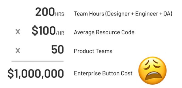
In practice, design systems are incredibly cost-effective. A newly designed button at a large scale can be incredibly expensive outside of a design system paradigm, as seen in this very, very serious diagram from the workshop.
Specifics on OUR approach
In our case, we use a singular design enum file that informs a set of hierarchical react + typescript components. Some constraints that have helped us run the gambit. If you have more than two style properties, it becomes a styled-component. If you can write it without a library, do it. Use picks instead or partials when passing props to the styled components. These components leverage storybook for documentation, utilize styled-components to do away with a big stylesheet and style-collisions, and enzyme testing for a sense of confidence in their behavior and aesthetic. Names should adhere to previously established patterns and should be as clear as possible.
Component folders are PascalCased just like the components names. Each component folder should in time have an example story file, a primary component file with default export, an index file, a testing file. Props like variant and size appear over and over. These notions are not hard and fast rules in every instance, but they provide a quick and approachable pattern to refer to. Willow’s root is nested deep inside the frontend src folder, then inside that component folders and an enum file. Maybe one hard rule, don’t mess with the enums file without giving me a heads up. Like ever. We will both just end up crying if you do.
A component called FormInput has options to do currency, percentage variants of your typical text component. It has variant, size as well as states for error, success, warning and info. You want a select well then there is FormSelect. Both components are only used in forms. You want buttons, loaders, biaxial graphs, drag and drop, percentage formatting… we’ve got lots of things. You want imagery, well you can pick from SpotIllustration or Icon. You need that string formatting to match the mock’s percentage value, we have a utility for that in Willow. Just patterns over and over in a small concise folder structure.
Naming these things, that took some trial and error. No more prepending component names all with Choozle for instance. That was hilarious and short lived, because then you cannot search very effectively if everything is Choozle this or Choozle that. Important as well to differentiate between composite components and singular components. We have our own approach to Atomic structure. But it works for us. You also have to deprecate and iterate on things over time.
It is a living system, the flock of components in Willow are all snapshots from a certain time in terms of who was on the team and what did they know. It gets better and better if you tend to it. Mocks can be labeled by their literal code component counterpart. Spacing can be approximated using the system we have in the enums. Mocks do not need to be measured down to the micron with a digital ruler. There is freedom within the constraints and autonomy once you get familiar.
Leverage the patterns, be thoughtful and considerate. Over time, the good decisions add up and everything becomes faster, more reliable, and incredibly cohesive. It’s a heavy lift at the beginning, but it becomes more stable and easier to use. Even when you do break something, it’s no big deal. You learn from it, fix it, test it, version it, update the imports, communicate changes, and try again. Once again, the things I have outlined are just our approach at Choozle. Where you are at may be very different, embrace that. Find ways to optimize and establish shared understanding and buy in.
In conclusion, design systems are living things, and they must be cared for. If you care about the details enough in the beginning, over time, the design system will take care of you, too. You need a village, a tribe to take care of your design system baby. I have a wonderful group of colleagues who put in time to contribute to, comment on and spitball with about Willow.
I am grateful for them everyday, so I want to say a special thank you to those folks, Ciara Bujanos, Genevieve Bulger, Kelly Miller, Caroline O’Donnell and my fellow design super friend Nate Thomas. I love you people and I am so lucky to work with you. This was also made possible by an excellent workshop, so thank you too Nathan Curtis. You are the man.
If you actually made it to the end, thanks. I know this may have been a lot to read. But consider yourself lucky, my first draft of this article used nucleobases as its primary analogy.